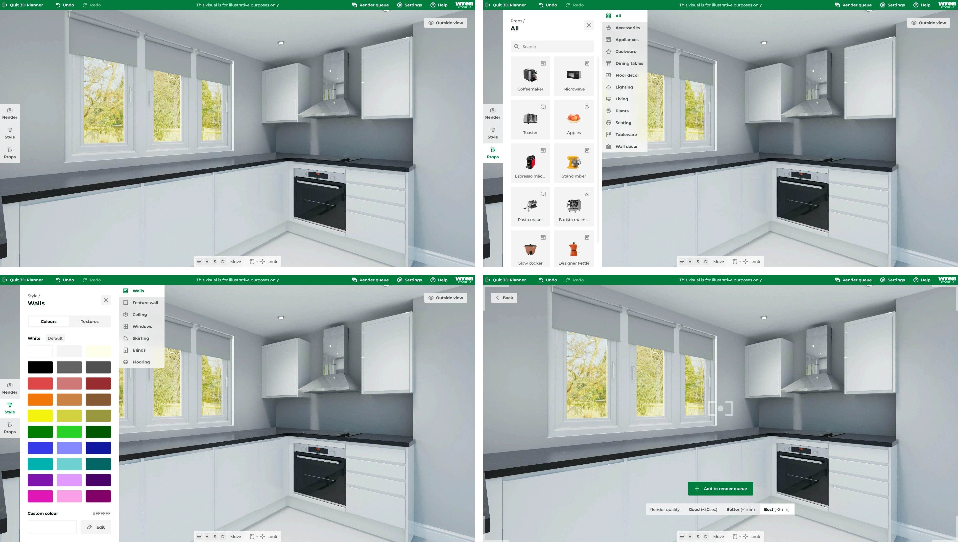
Accelerated Time-On-Task By 58%
Responsibilities
UI Design, UX Design, User Research, End-To-End Ownership, Iconography Design
Team
1 Head of Design
1 Full Stack Developer
1 Head of Operations
1 Business Analyst
Summary
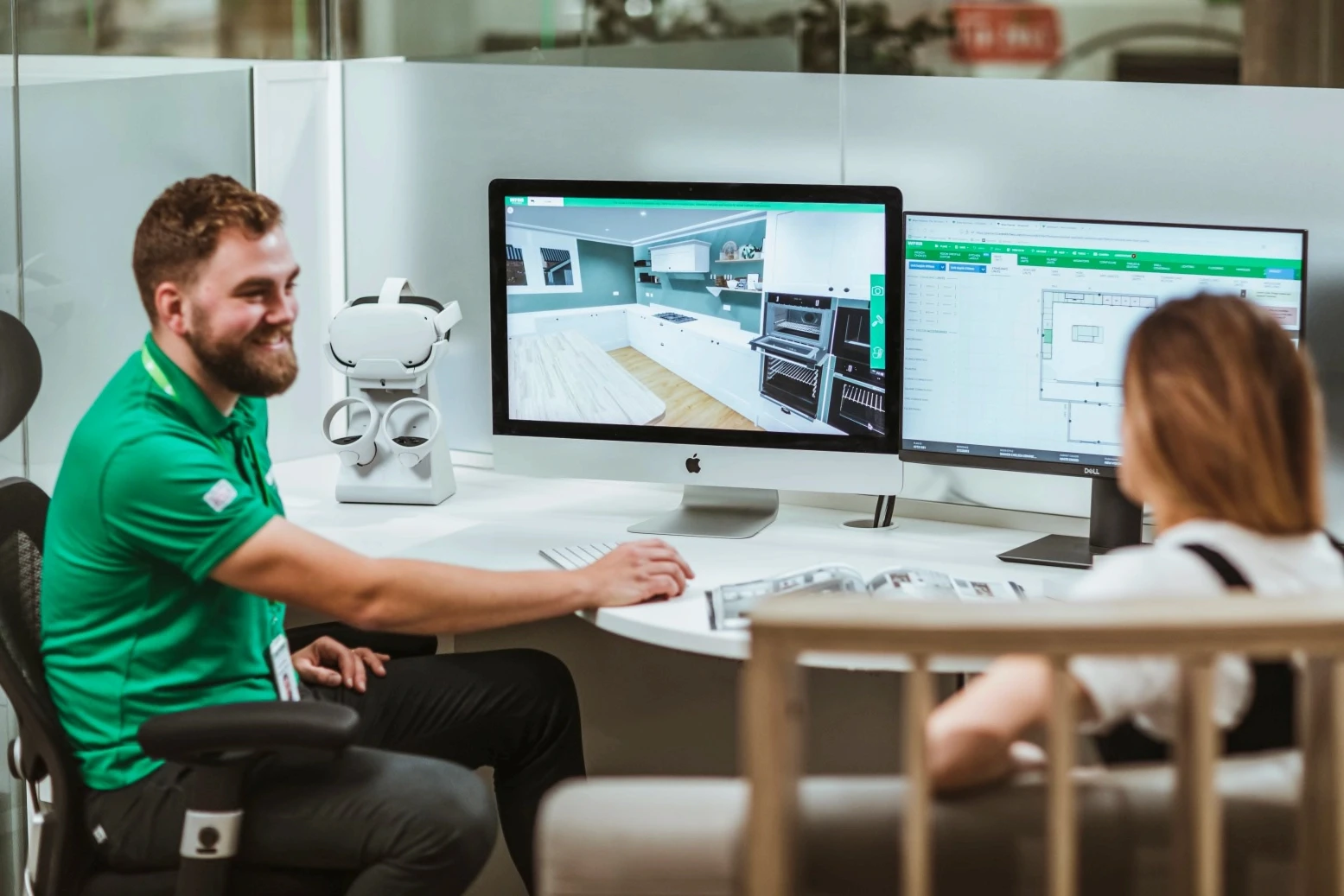
I redesigned Wren’s 3D kitchen planner to improve usability, address inefficiencies, and enhance scalability. By tackling issues like task speed, feature discoverability, and accessibility, I created a streamlined interface that helps Kitchen Sales Designers craft kitchens with ease and efficiency.
Wren Kitchens at a Glance
Wren Kitchens, a kitchen manufacturer and retailer, with 7,000 staff, 119 showrooms across the UK and US, and £1 billion in annual sales, ships 2,000 kitchens weekly.
Pain Points
Time-consuming workflows that hindered efficiency.
Poor feature discoverability, leading to user frustration.
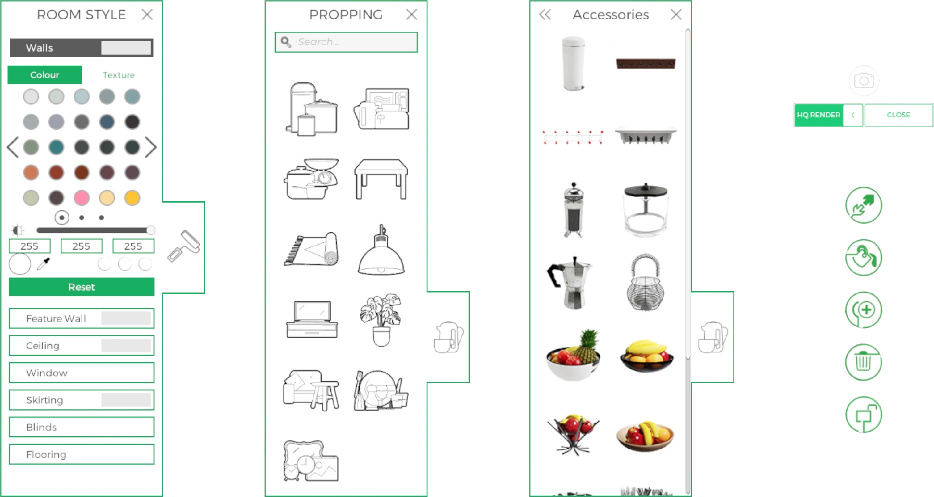
Difficulty navigating and understanding unclear iconography.
Limited customization, advanced features ignored.
These pain points collectively prevented Kitchen Sales Designers from maximizing their selling potential.
Business & User needs
Business Needs
Increase sales by enabling Kitchen Sales Designers to dedicate more time to customers.
Minimize key administrative inefficiencies in the entire planning process.
Reduce training costs by developing an intuitive, user-friendly system.
User Needs
Improve speed and efficiency to minimize friction and reduce time spent styling and rendering kitchens.
Facilitate discoverability of key features to enhance usability.
Support scalability with a design that accommodates future enhancements without extensive retraining.
Research & Discovery
Stakeholder Interviews
I collaborated with kitchen sales designers and business analysts to identify key challenges with the 3D planner. Key insights included:
"Styling doesn’t need to be highly accurate; it’s primarily about showing potential outcomes."

Gabrielle, Kitchen Sales Designer
"Advanced features like custom colours are rarely used, as users consistently prioritise speed."

Sam, Business Analyst
Jobs-to-Be-Done (JTBD)
I used the JTBD framework to focus on specific user objectives rather than abstract personas:
Create visually compelling kitchen designs quickly to maximise customer engagement.
Navigate the 3D planner seamlessly to access tools and features without interruption.
Reduce troubleshooting time by addressing unclear or unintuitive functionality.
Ensure tasks are easily completed with minimal reliance on trial-and-error learning.
Unlike personas, which focus on abstract archetypes, JTBD offered a task-driven perspective, aligning with the project's goals of streamlining workflows and supporting rapid iteration.
Desk Research
Reviewed competitor tools and industry standards to benchmark features and usability trends. Findings emphasised the importance of discoverability and efficiency.
Initial Testing of the Old 3D Planner
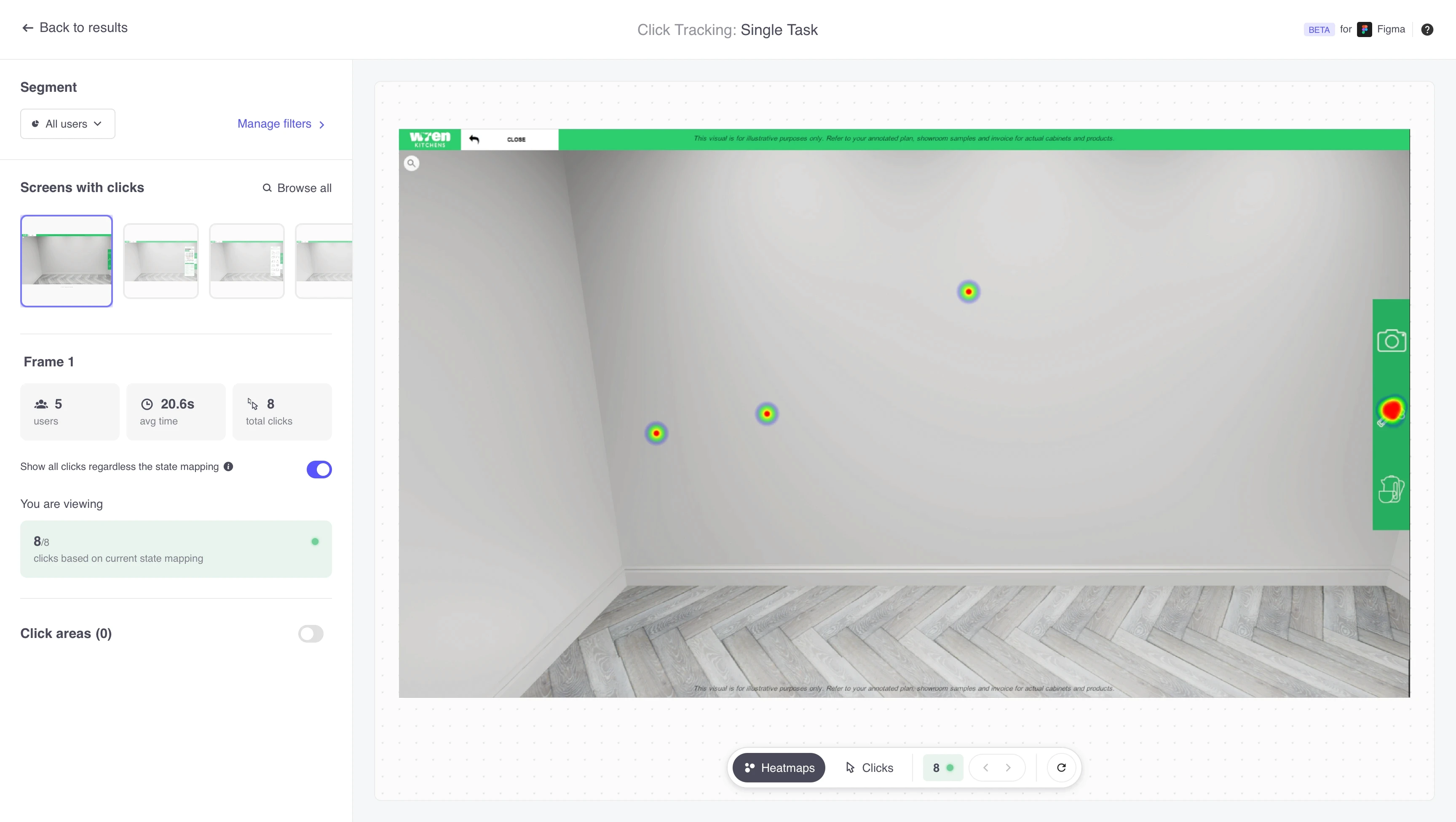
Unmoderated usability tests exposed key issues:
Participants struggled with unclear iconography.
Task completion times were longer than expected.
Design Process
Wireframing
Created a comprehensive amount of low-fidelity wireframes to map user flows and initial layouts.
Iterated designs based on feedback from stakeholders, ensuring alignment with user needs and business objectives.
High-Fidelity Prototyping
Developed interactive prototypes to validate user flows and demonstrate motion interactions.
Emphasized iconography for rapid recognition, improving navigation efficiency.
User Interface (UI) Design
Designed a clean, modular interface adhering to Wren’s brand guidelines while addressing usability gaps.
Used accessible colour palettes and typography to enhance inclusivity, ensuring compliance with AA standards.
Usability Testing
Conducted both moderated and unmoderated usability tests, revealing significant reductions in time-on-task – 33s to 14s on key workflows.
Render image time-on-task times initially increased by 38% during testing, underscoring the importance of optimising this process in subsequent iterations.
Implemented changes based on feedback, such as better labelling, tooltips, and cues to improve navigation clarity.
Iteration & Refinement
Addressed discoverability issues, enabling users to complete tasks intuitively.
Balanced new feature integration with familiar design patterns to minimise user alienation.
Outcomes & Impact
Achievements
The redesign achieved AA compliance by enhancing colour contrast, typography, and usability to ensure inclusivity.
A modular design was implemented, allowing future enhancements such as scene customizations and collaborative tools without disrupting existing workflows.
Impact
Version 0 > Version 2
Testing demonstrated a significant reduction in time-on-task for workflows, enabling designers to focus more on customer interactions.
Reflections & Learnings
Key Challenges
Balancing familiar design elements with necessary changes was challenging. Legacy features were preserved to avoid alienating users, while ineffective elements underwent rework to enhance efficiency.
Empowering new features required avoiding cognitive overload. Initial ideas focused on reducing visual clutter while ensuring key functionalities were accessible.
What I’d Do Differently
Encourage broader and more open-ended testing to uncover unbiased insights and deeper user feedback.
Start ideation earlier to explore a broader range of innovative solutions, fostering more creativity and adaptability.
Additional Insights
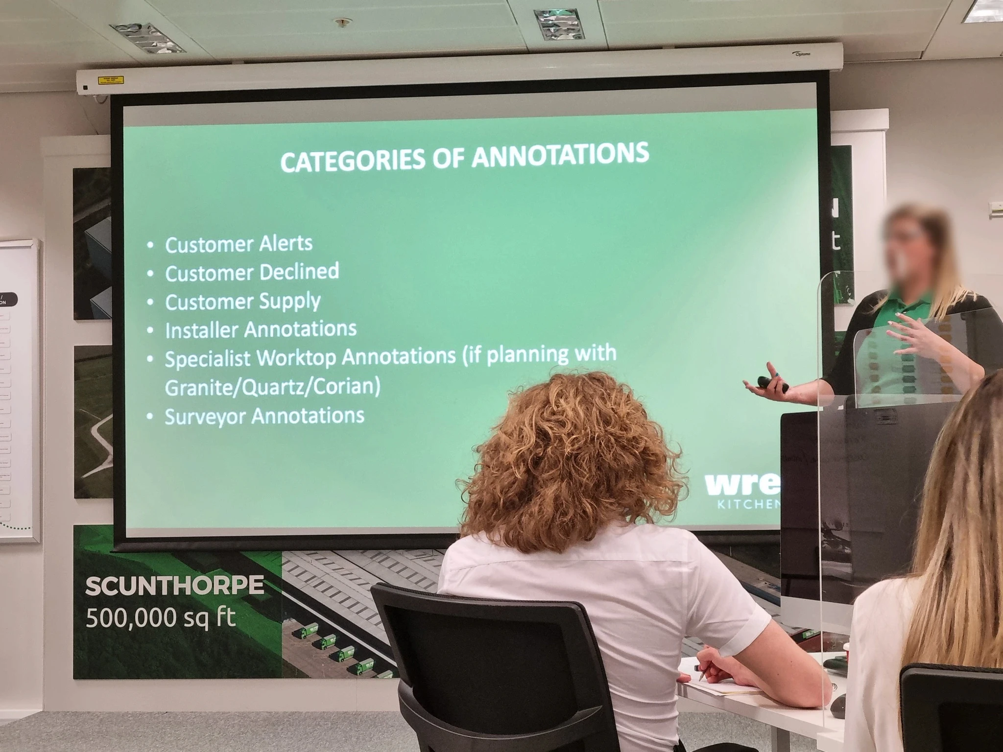
Training materials were often insufficient, leaving users to rely on trial-and-error learning.
Discoverability issues, such as finding specific props, were a common source of frustration. Addressing these gaps in the new design significantly reduced onboarding time.
