·

Airbnb Insurtech Startup, Raised £2.5M

Airbnb Insurtech Startup, Raised £2.5M

Airbnb Insurtech Startup, Raised £2.5M

Design & Dev Expedited By 25%

Design & Dev Expedited By 25%

Design & Dev Expedited By 25%

Design & Dev Expedited By 25%

Design System

Project Type

Insurtech

Industry

End-To-End

Project Scope

8m Read

Reading Time

Design System

Project Type

Insurtech

Industry

End-To-End

Project Scope

8m Read

Reading Time

Design System

Project Type

Insurtech

Industry

End-To-End

Project Scope

8m Read

Reading Time

My Role

UI Design, UX Design, User Research, End-To-End Ownership

Team

1 Product Owner
2 Full Stack Developers

Summary

I developed a scalable design system for Pikl, addressing inefficiencies in design workflows and ensuring consistency across products. By integrating research-driven methods and adaptable components, I streamlined processes and enabled faster design-to-development handoffs, helping Pikl maintain agility in its startup environment.

The Problem

Pikl's growth as an insurtech startup revealed inefficiencies in its fragmented design and development workflows. Lacking a centralised design system, the company struggled to maintain product uniformity, limiting scalability and agility.

The Problem

Pikl's growth as an insurtech startup revealed inefficiencies in its fragmented design and development workflows. Lacking a centralised design system, the company struggled to maintain product uniformity, limiting scalability and agility.

The Problem

Pikl's growth as an insurtech startup revealed inefficiencies in its fragmented design and development workflows. Lacking a centralised design system, the company struggled to maintain product uniformity, limiting scalability and agility.

The Problem

Pikl's growth as an insurtech startup revealed inefficiencies in its fragmented design and development workflows. Lacking a centralised design system, the company struggled to maintain product uniformity, limiting scalability and agility.

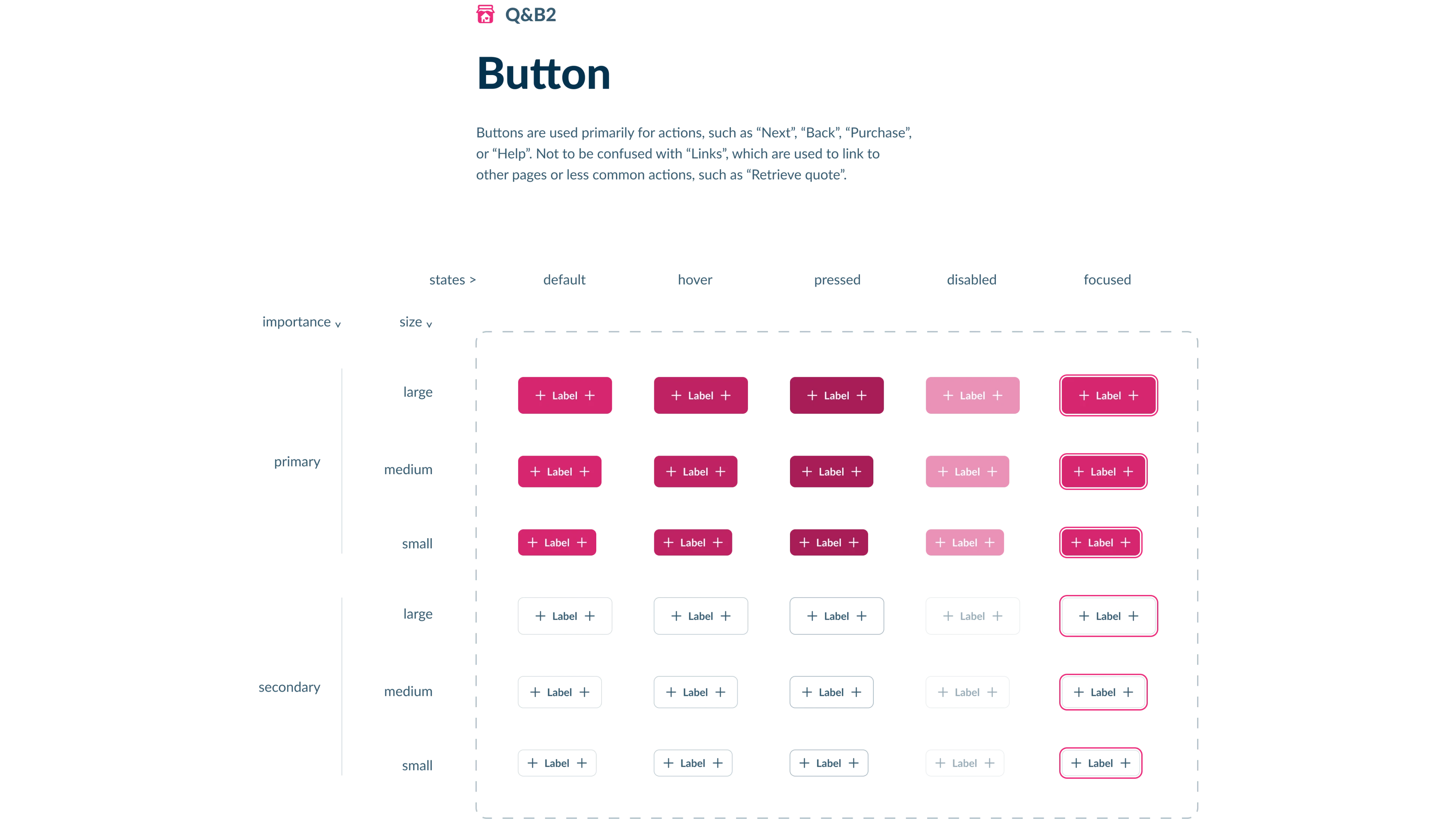
Button component design system showcasing different states, sizes, and importance levels for primary and secondary buttons.

Design system for button components with various states and styles.

1

Reference Number

Image

Media Type

Button component design system showcasing different states, sizes, and importance levels for primary and secondary buttons.

Design system for button components with various states and styles.

1

Reference Number

Image

Media Type

Button component design system showcasing different states, sizes, and importance levels for primary and secondary buttons.

Design system for button components with various states and styles.

1

Reference Number

Image

Media Type

Button component design system showcasing different states, sizes, and importance levels for primary and secondary buttons.

Design system for button components with various states and styles.

1

Reference Number

Image

Media Type

Pain Points

Inconsistent component usage led to mismatched designs and increased complexity.

Lack of clear processes extended development timelines and created confusion.

The absence of a modular system made it difficult to adapt designs for new products and partners.

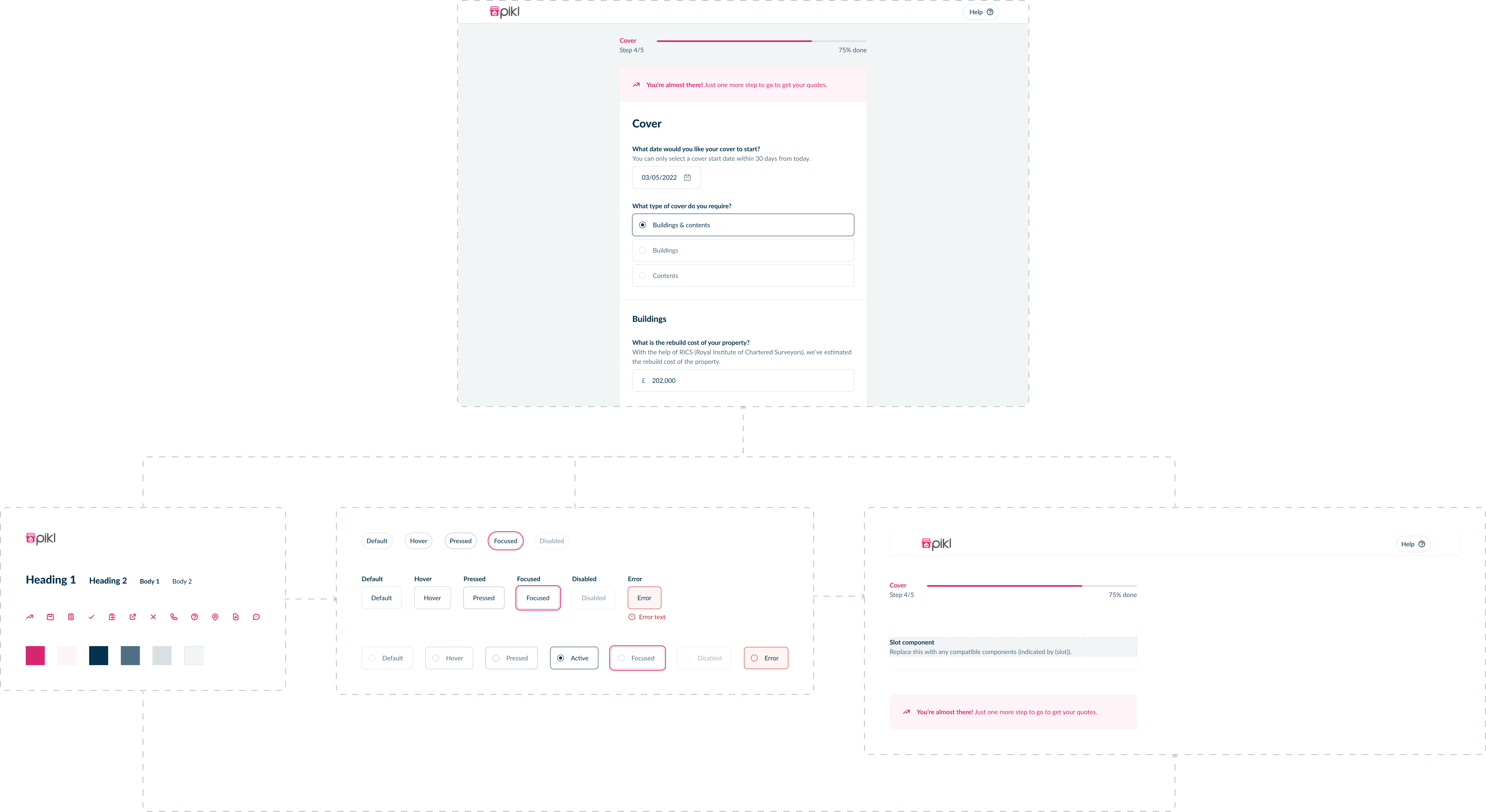
Component-based design system for an insurance quote form, showcasing typography, buttons, colors, and form elements.

UI component system for a structured and consistent insurance quote flow.

2

Reference Number

Image

Media Type

Component-based design system for an insurance quote form, showcasing typography, buttons, colors, and form elements.

UI component system for a structured and consistent insurance quote flow.

2

Reference Number

Image

Media Type

Component-based design system for an insurance quote form, showcasing typography, buttons, colors, and form elements.

UI component system for a structured and consistent insurance quote flow.

2

Reference Number

Image

Media Type

Component-based design system for an insurance quote form, showcasing typography, buttons, colors, and form elements.

UI component system for a structured and consistent insurance quote flow.

2

Reference Number

Image

Media Type

Goals & Approach

Goals

Establish a consistent user experience across all devices.

Modernise key design elements to better align with evolving user expectations.

Simplify component usage with clear, practical examples and detailed edge cases.

Enable scalability to support diverse design requirements.

Approach

Conducted extensive research on design patterns and component usage.

Introduced "slot components" akin to picture frames—versatile structures allowing for varied content while maintaining consistent styling.

Designed components to be easily customisable for potential insurance partners, ensuring adaptability.

Reusable slot component for displaying content within a card layout.

3

Reference Number

Rive animation

Media Type

Reusable slot component for displaying content within a card layout.

3

Reference Number

Rive animation

Media Type

Reusable slot component for displaying content within a card layout.

3

Reference Number

Rive animation

Media Type

Reusable slot component for displaying content within a card layout.

3

Reference Number

Rive animation

Media Type

The Design System

Consistency Through Coherent Flexibility

Components were designed for predictable behaviour across device sizes, ensuring users experience uniformity regardless of platform.

Slot components provided structured flexibility, addressing project variations without compromising consistency.

Streamlined Design-to-Dev Handoff

Utilised tools like Zeplin and Storybooks for efficient version control and documentation.

Simplified processes reduced confusion and time spent navigating Figma boards, enabling faster updates.

Enhanced Micro-Interactions

Integrated animations to improve visual communication without detracting from brand identity or usability.

Responsive insurance quote form optimized for desktop, tablet, and mobile.

4

Reference Number

Rive animation

Media Type

Responsive insurance quote form optimized for desktop, tablet, and mobile.

4

Reference Number

Rive animation

Media Type

Responsive insurance quote form optimized for desktop, tablet, and mobile.

4

Reference Number

Rive animation

Media Type

Responsive insurance quote form optimized for desktop, tablet, and mobile.

4

Reference Number

Rive animation

Media Type

Design handoff process from Figma to Zeplin and Storybook for collaboration.

5

Reference Number

Rive animation

Media Type

Design handoff process from Figma to Zeplin and Storybook for collaboration.

5

Reference Number

Rive animation

Media Type

Design handoff process from Figma to Zeplin and Storybook for collaboration.

5

Reference Number

Rive animation

Media Type

Design handoff process from Figma to Zeplin and Storybook for collaboration.

5

Reference Number

Rive animation

Media Type

Measuring Success

Adoption rates across diverse teams validated the design system’s overall impact.

Reduced confusion and time spent locating designs.

Design updates now take a small fraction of the time previously required.

The system’s modularity supports future feature expansion with minimal effort.

Design system adapting to different partner brands.

6

Reference Number

Rive animation

Media Type

Design system adapting to different partner brands.

6

Reference Number

Rive animation

Media Type

Design system adapting to different partner brands.

6

Reference Number

Rive animation

Media Type

Design system adapting to different partner brands.

6

Reference Number

Rive animation

Media Type

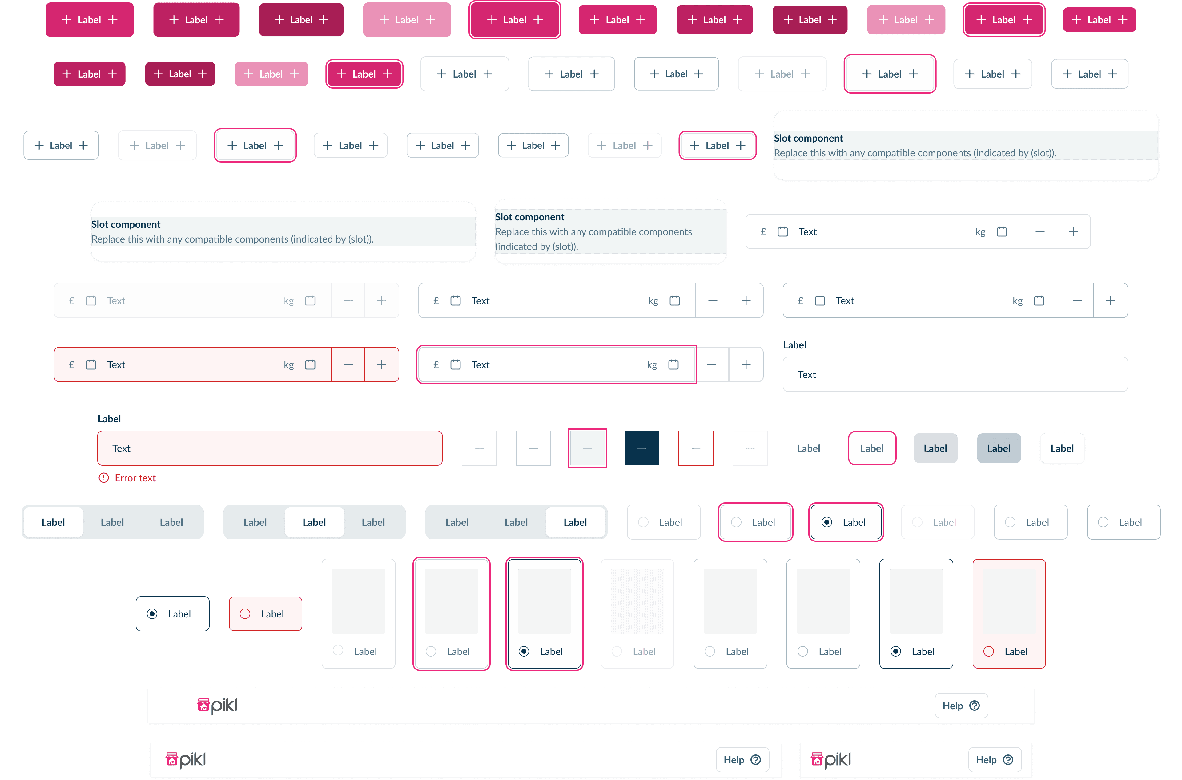
A collection of UI components from a design system, including buttons, input fields, slot components, labels, and selection controls, demonstrating various states and styles.

Comprehensive UI component set from the design system.

7

Reference Number

Image

Media Type

A collection of UI components from a design system, including buttons, input fields, slot components, labels, and selection controls, demonstrating various states and styles.

Comprehensive UI component set from the design system.

7

Reference Number

Image

Media Type

A collection of UI components from a design system, including buttons, input fields, slot components, labels, and selection controls, demonstrating various states and styles.

Comprehensive UI component set from the design system.

7

Reference Number

Image

Media Type

A collection of UI components from a design system, including buttons, input fields, slot components, labels, and selection controls, demonstrating various states and styles.

Comprehensive UI component set from the design system.

7

Reference Number

Image

Media Type

Results

Martin, Senior Software Engineer

Feedback

"I no longer have to navigate slowly through a Figma artboard to find what I need; it's now easily accessible."

Martin, Senior Software Engineer

Feedback

"I no longer have to navigate slowly through a Figma artboard to find what I need; it's now easily accessible."

Martin, Senior Software Engineer

Feedback

"I no longer have to navigate slowly through a Figma artboard to find what I need; it's now easily accessible."

Martin, Senior Software Engineer

Feedback

"I no longer have to navigate slowly through a Figma artboard to find what I need; it's now easily accessible."

Handoff is less chaotic. Extra design cleanup is skipped, and everything is pushed directly to Zeplin and Storybooks, streamlining the process.

Updating designs takes a tenth of the time. For example, creating new components or modifying existing ones now feels effortless compared to previous workflows.

The entire company now has a "single source of truth" for styling and components, which has improved collaboration and minimised design inconsistencies.

Reflections & Learnings

Key Challenges

Convincing teams to adopt a new process required patience and clear communication, addressing initial resistance.

Balancing flexibility with consistency was challenging but essential, illustrating the complexity in scalability.

What I’d Do Differently

Invest more time in early user feedback sessions.

Provide detailed training for cross-functional teams on the system’s usage.

Explore more automation tools to further simplify the design-to-development workflow.
Next Steps

Your Goals, My Expertise—Let’s Build A Lasting Partnership

With 15 years of design experience, I create tailored solutions that address your needs and foster long-term partnerships.

Your Goals, My Expertise—Let’s Build A Lasting Partnership

With 15 years of design experience, I create tailored solutions that address your needs and foster long-term partnerships.

Your Goals, My Expertise—Let’s Build A Lasting Partnership

With 15 years of design experience, I create tailored solutions that address your needs and foster long-term partnerships.

Your Goals, My Expertise—Let’s Build A Lasting Partnership

With 15 years of design experience, I create tailored solutions that address your needs and foster long-term partnerships.

© 2025 John Miller

© 2025 John Miller

© 2025 John Miller

© 2025 John Miller