
Introduction
Wren Kitchens, a kitchen retailer with 7,000 employees, £1b annual sales¹, shipping 2,000 kitchens a week² with 109 showrooms in the UK and 10 in the US³. “Kitchen Sales Designers” sit in those showrooms, and comprise most of Wren's 3D kitchen planner user base.
Introduction /
The problem
Kitchen sales designers are hindered by time-consuming administrative tasks and an inefficient 3D planner, leading to reduced selling time and fewer secured leads.
Introduction /
The solution
A 3D kitchen planner that balances speed, content, and features to equip sales reps for efficiently meeting customer needs, allowing them to focus on selling.
Introduction /
The business & user needs
Scalability
The UI needed to accommodate upcoming features to the 3D planner, such as changing the outside scene.
Reduce friction and time-on-task
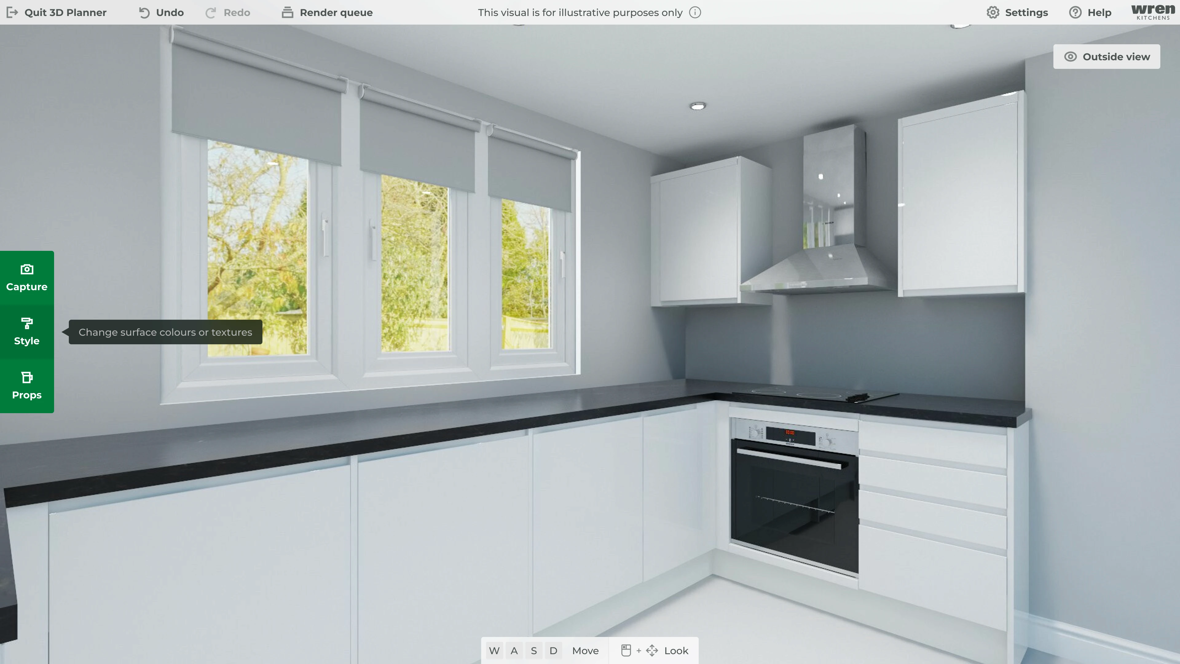
Salespeople needed to go from a blank kitchen render to a fully furnished one as efficiently as possible.
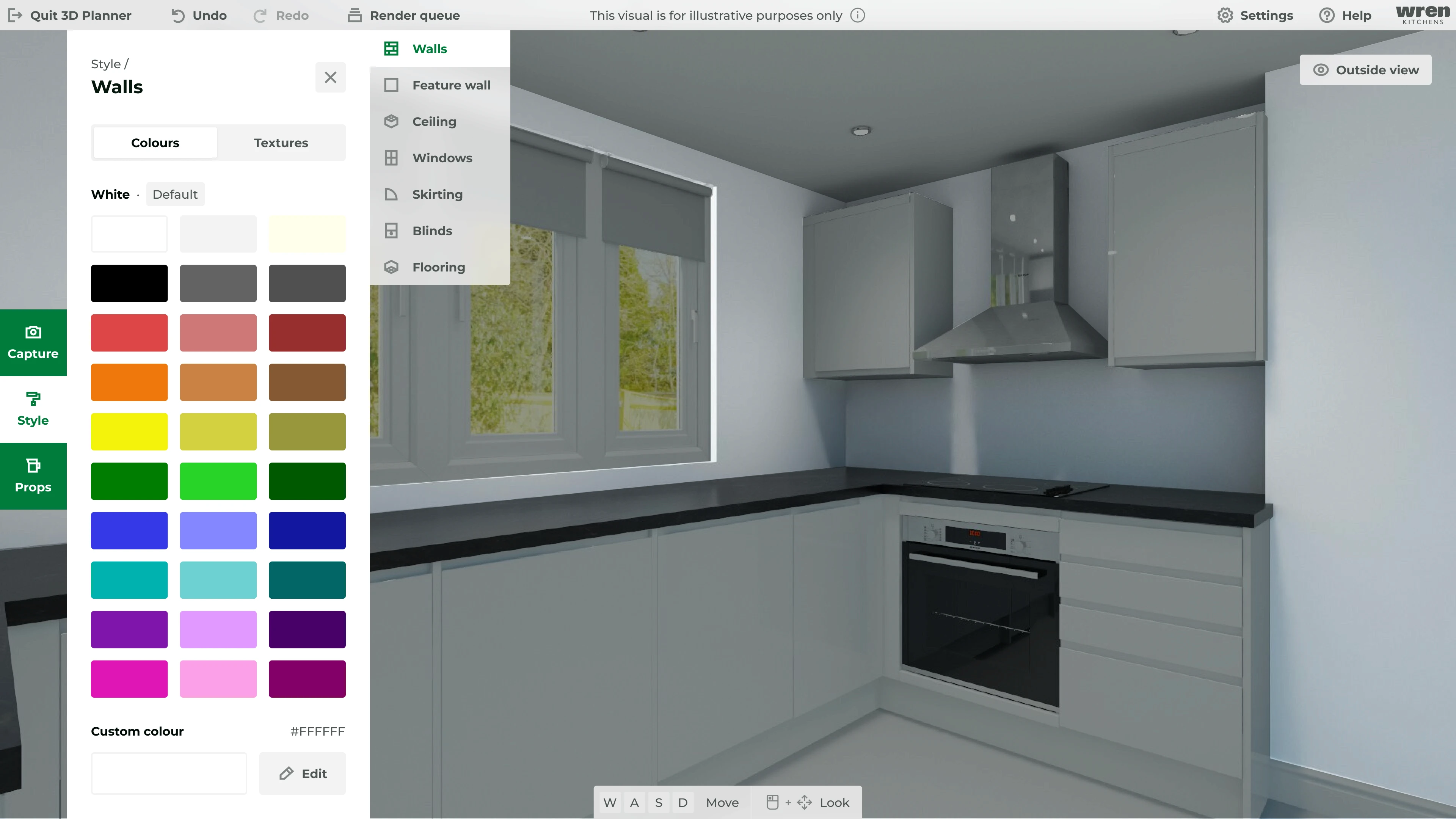
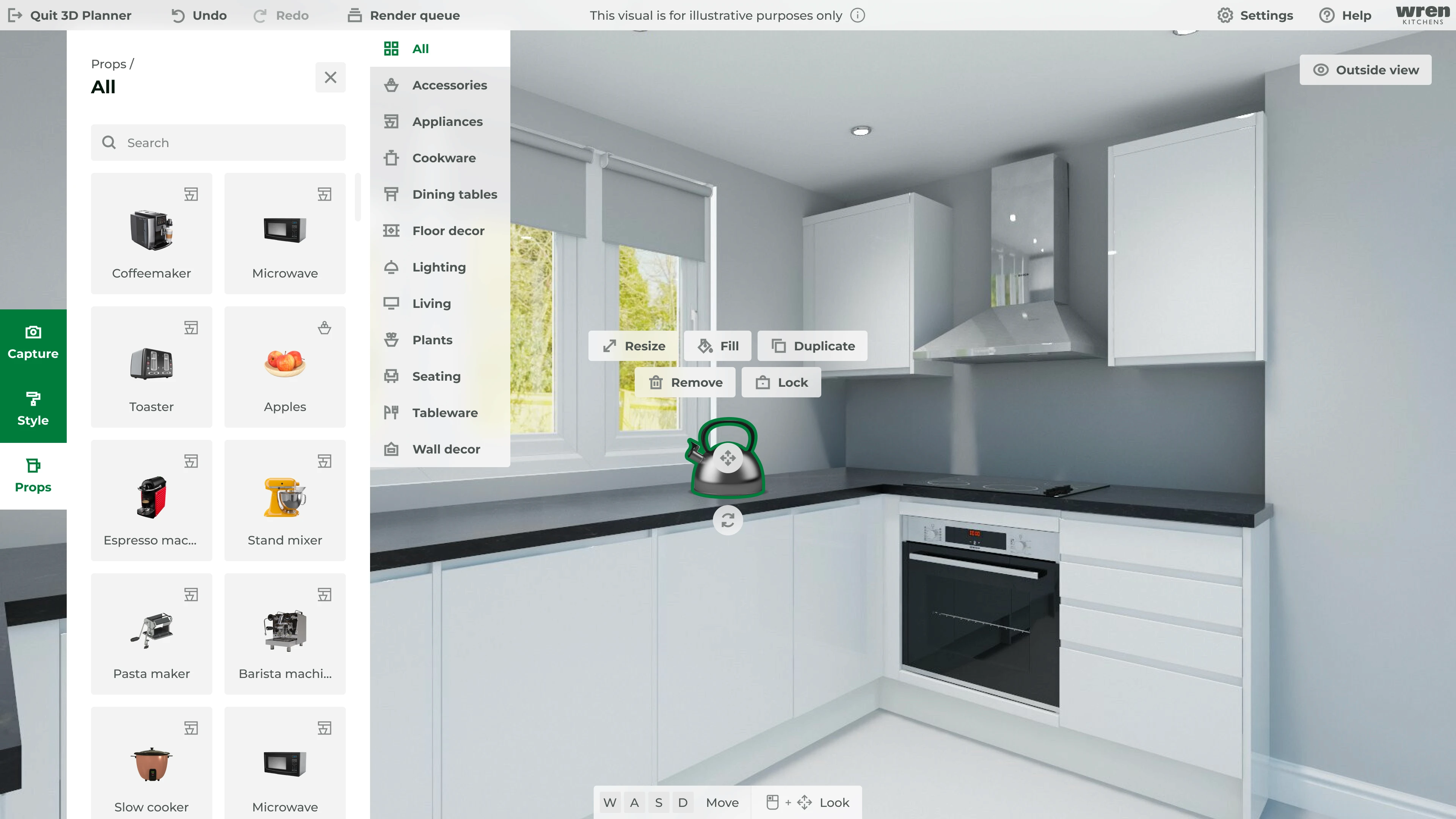
Style surfaces, add props and render a kitchen image
To furnish a kitchen completely, salespeople must proficiently perform these three tasks to meet the customer's design criteria.


Research
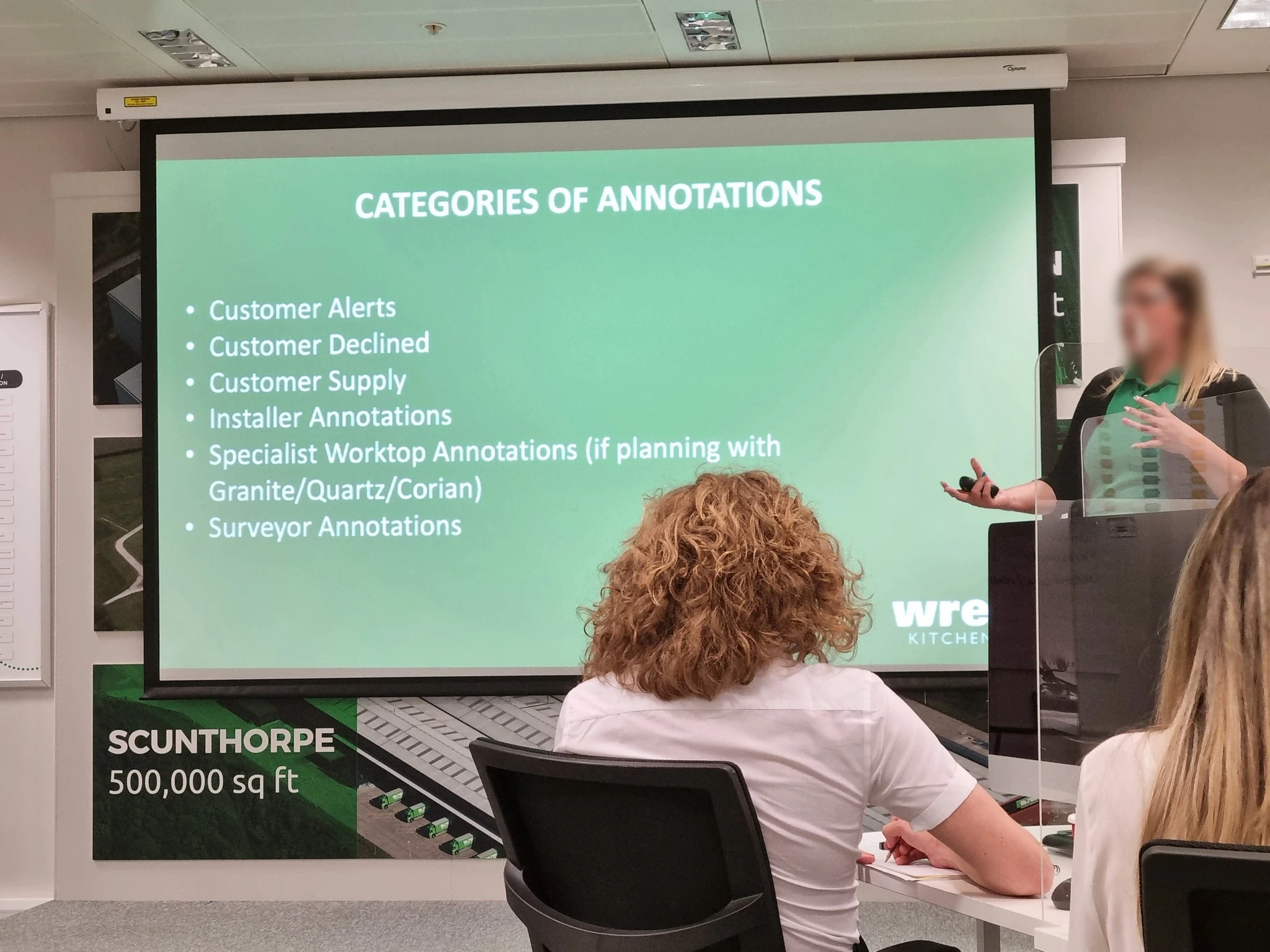
The following methods/outcomes were chosen for the discovery phase, to uncover the context, needs, problem areas etc. Limited availability of Kitchen Sales Designers still yielded sufficient methods for informed design decisions.
Research /
Stakeholder insights
"Reps are less likely to require in depth features since they prioritise speed and they have another tool for a detailed plan of a kitchen. The 3D planner is just for styling, propping and renders (so far)."
— Gabrielle, Kitchen Sales Designer
"Styling usually doesn’t need to be accurate as the programs purpose is to show what the customer’s kitchen could look like"
— Sam, Business Analyst
"Very few reps use the custom colour options and most of them don't like scrolling to find what they need"
— Sam, Business Analyst
Research /
Training insights
Insufficient guidance
The 3D planner was seen as a secondary tool in training, leading to insufficient guidance on tasks like styling, propping, and rendering.
Discoverability issues
People spent a long time trying to find specific props.
Heuristic methods
Some people didn’t know how to move around the kitchen, some also completed tasks more through trial and error.
— Training presentation for a Kitchen Sales designer

Research /
Desk research
Research / Desk research /
Kitchen Sales Designer job reviews
General issues
High staff turnover, hard to manage workloads, "very clicky" working environment, 2D/3D planner slow and sluggish.⁴
3D planner feedback
People mostly viewed the 3D planner positively, despite some mentioning bugs, slowness, and a competitor's superior system.⁵
Research / Desk research /
Salesperson findings
'Reps only spend around 1/3 of their time selling and pitching to customers. The rest is searching for/creating content and admin.'
— Docurated⁶
'The time spent actually selling and servicing clients is shown positively to influence salesperson performance.'
— Journal of Business & Industrial Marketing⁷
'Salesperson responsiveness is found to have a positive relationship with customer satisfaction.'
— Industrial Marketing Management⁸

Research /
Old 3D planner testing
Based on research and issue ranking, tracking time-on-task is crucial due to its impact on lead generation and training cost reduction. Testing the original 3D planner for this key metric also revealed potential usability issues.
Research / Old 3D planner testing /
Unmoderated testing
Due to user unavailability, an unmoderated usability test was conducted with 5 random users with similar attributes to a 'Kitchen Sales Designer'. Four tasks were given to the participants, these are the results:
"In order to change the wall colour I first clicked on the 3D wall"
— Participant when changing wall colour
"Not completely sure what each icon represented"
— Participant when adding a prop
"Some tooltips when hovering might help, also add text clues as well as pictorial ones"
— Participant when asked about improving navigation
Research / Old 3D planner testing /
Moderated testing
A 3D design industry expert was consulted for moderated testing. Although they're not part of the target audience, they were chosen to provide more detailed feedback (due to their familiarity with 3D tools).
"It would be great if the camera guidelines changed colour when taking a picture to enhance confirmation"
— Judy, Industrial Designer
"The magnifying glass icon seems unrelated to altering the kitchen view to the outside"
— Judy, Industrial Designer

Ideation
To cover all angles, different ideas were rapidly devised and tested, their direction was inspired by all the previous research.

Ideation /
Rapid prototype feedback
To address every aspect, I rapidly devised and tested different ideas that were inspired by the old 3D kitchen planner's findings.
What worked
The main feedback received confirmed the strategy of optimising speed works. Simplified functionality, layout and flows helped to achieve this.
"I like that all the tabs are visible and you can easily browse between them."
— Gabrielle, Kitchen Sales Designer
What didn't work
As expected, using traditional methods of display menus through accordions didn't work since it takes an extra click to view all the options a user would need to access.
"I don't think Option B would work as well, as you have to click on the menu and look to find the right tab you want with no icons"
— Gabrielle, Kitchen Sales Designer

Ideation /
User interface (UI)
Given the numerous planner categories, iconography took precedence in UI design due to its rapid human recognition.⁹ Also, creating distinct and pertinent icons for each category increased design time.
The remaining interface followed Wren's style guidelines, seamlessly incorporating a basic typography scale, colours, and spacing with minor adjustments.

Ideation / User interface (UI) /
Testing high-fidelity designs (version 1)
Early 3D planner testing revealed a trend: around half of the participants naturally clicked the wall to change its colour. Despite labelling the main buttons, this behaviour persisted, indicating limited impact from changing the label.
"I struggled to find the specific place I needed because 'render' is a bit of a strange name for what, in this study, feels more like a screenshot"
— Participant when finding the render button
"The camera style corners helped me determine it was a photo"
— Participant when taking a photo render

Ideation / User interface (UI) /
Testing high-fidelity designs (version 2)
Excluding unrelated technical issues, the second 3D planner version received positive feedback in both observation and communication. This success resulted from adjustments to labelling, hierarchy and interaction behaviour.
"It was easy and efficient, the icons were clear and the tools were useful."
— A participant when asked about their overall experience
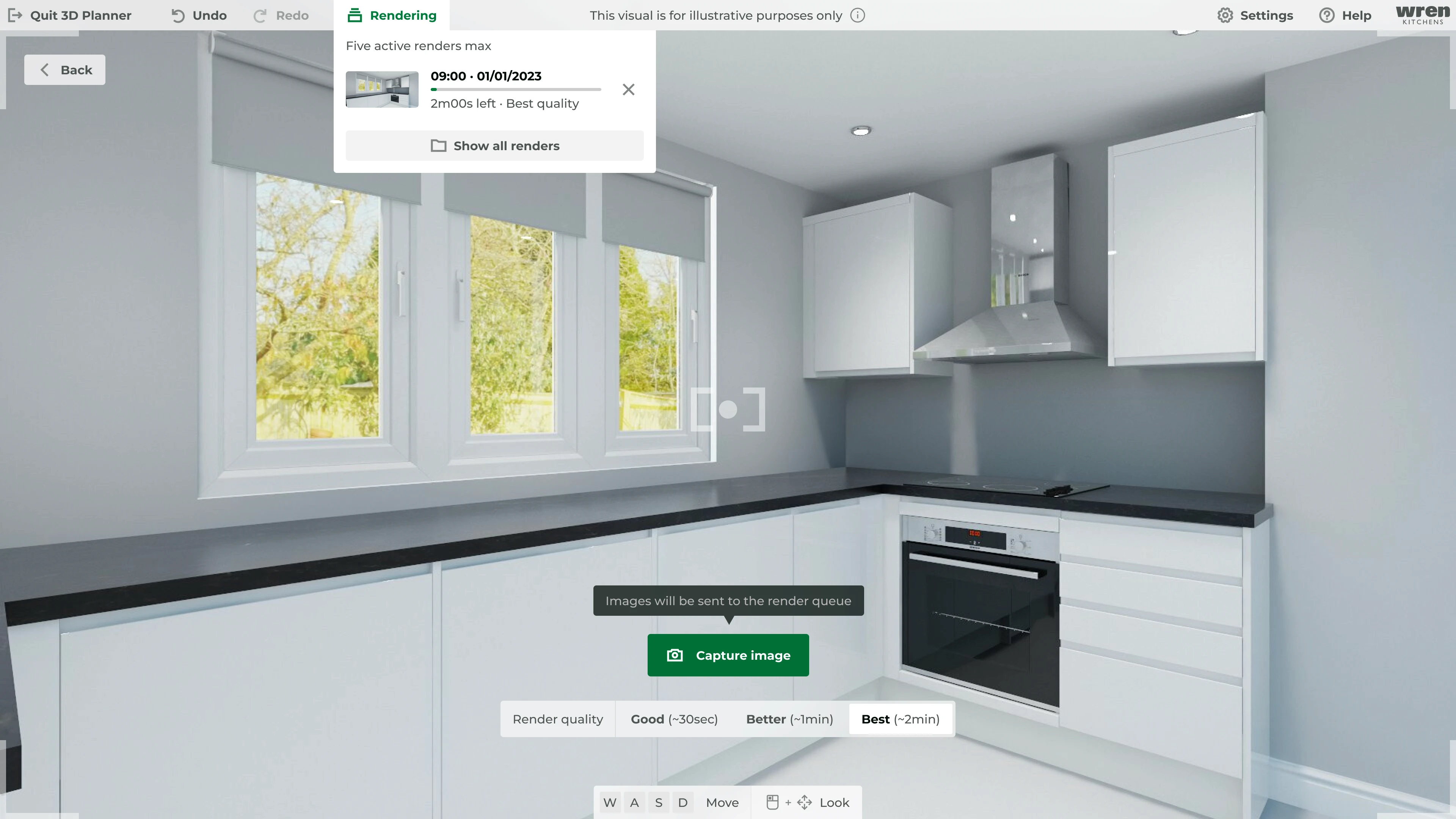
Final designs
A multitude of design decisions went into this 3D kitchen planner redesign. From tooltips and labelling to interaction behaviour and hierarchy. Via all of the testing done, these changes seemed to have the biggest impact:
Adding labels to most elements
Using widely recognised terminology
Allowing multiple interactive paths to the same endpoint
Reducing visual clutter and unnecessary features
Final designs /
Animating details
While system resources prioritised the 3D aspect of the planner, minimal animation was added where necessary. For instance, adding a prop by clicking (instead of dragging) triggers an entrance animation, ensuring attention without distraction.
Reflection & results
Reflection & results /
What did I find challenging?
Introducing new ideas
Retaining old design prevents user alienation. Yet, ineffective elements shouldn't persist unchanged; conveying this idea was hard.
Finding the right balance
Prioritising speed drove the design, yet striking the ideal speed to content/ability balance posed a challenge.
Restricting feature creep
Balancing empowerment and impressing users with new features while avoiding cognitive overload proved difficult.
Reflection & results /
What would I have done differently?
Be less restrictive
At first, I restricted my ideation to minimise negative reactions to change. Now, I see that this limited my creative potential.
Observe more
Familiar user feedback can hide true opinions. In the future, I will emphasise honesty and observe more for better testing results.
Reflection & results /
Final results
While the project didn't launch, it's still valuable to highlight the potential impact of the redesign. Though precise business effects are challenging to gauge, earlier research strongly suggests enhanced sales performance. Furthermore, a more user-friendly interface could lower training expenses and time spent on the 3D planner.
Combined average time-on-task results
Version 0
33s
Version 2
14s
-58%
Sources
https://www.theretailbulletin.com/home-and-diy/wren-kitchens-surges-towards-1b-annual-sales-mark-after-30-growth-in-2021-17-05-2022/
https://www.insightdiy.co.uk/news/wren-kitchens-nears-1bn-in-turnover/11239.htm
https://www.wrenkitchens.com/showrooms
https://uk.indeed.com/cmp/Wren-Kitchens/reviews?fjobtitle=Kitchen+Designer&fcountry=GB
https://www.glassdoor.co.uk/Reviews/Wren-Kitchens-Kitchen-Sales-Designer-Reviews-EI_IE505341.0,13_KO14,36.htm?filter.jobTitleFTS=Kitchen+Sales+Designer&filter.iso3Language=eng&filter.employmentStatus=REGULAR&filter.employmentStatus=PART_TIME
https://02f0a56ef46d93f03c90-22ac5f107621879d5667e0d7ed595bdb.ssl.cf2.rackcdn.com/sites/10980/uploads/13828/Docurated-State-of-Sales-Productivity-Report20161210-21939-1jyfkit.pdf
https://www.consensus.app/details/time-spent-actually-selling-servicing-clients-shown-brashear/362aaa1aa6ed52488c561693ce5dc34d/
https://www.consensus.app/details/also-salesperson-responsiveness-found-relationship-agnihotri/e6e2e140b6295e979e71dafb068c1395/
https://www.nngroup.com/articles/icon-usability/


