Designing for the Invisible Team
Responsibilities
UI Design, UX Design, User Research
Team
1 Product Owner
1 Head of Design
1 Head of Operations
2 Full Stack Developers
Summary
Pikl’s policy admin system faced inefficiency and poor usability, directly impacting the customer support team’s productivity. Through research with end users and iterative design, I delivered a modernised concept that streamlined workflows and boosted stakeholder confidence in the redesign's potential.
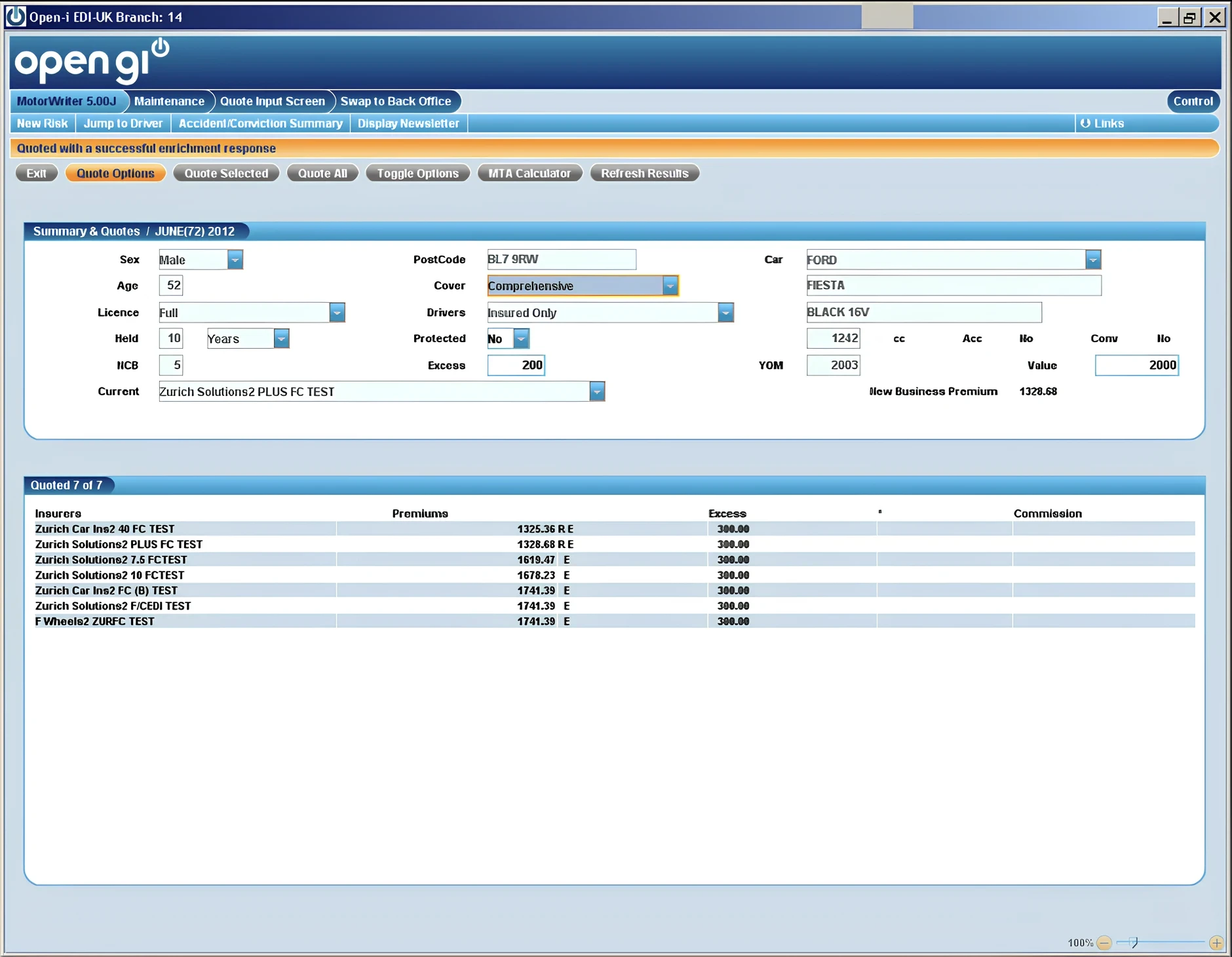
Pain Points
Staff relied heavily on memory due to untailored logic and a lack of contextual guidance, increasing errors.
Routine tasks like customer email management required disconnected tools, prolonging resolution times.
Navigating through exhaustive manual scripts for diverse scenarios was time-consuming and error-prone.
The outdated system lacked modern conveniences, leading to low morale and inefficient workarounds.
Research & Insights
Research Methods
Conducted in-person sessions with customer support team members to understand workflow pain points and gather insights directly from end users.
Reviewed best practices for admin interfaces, competitor analysis, and internal documentation.
Partnered closely with the product owner to guide major design decisions.
In-person collaboration was a natural choice, as the team was nearby, allowing quick feedback and direct insights. Best practices accelerated design to match Pikl’s startup pace, while collaborative planning ensured alignment with stakeholders and user needs.
Key Insights
These quotes reveal the key challenges faced by the customer support team and ground the insights in real user experiences.
Inefficiencies
"Calculating all paid amounts is done manually with a calculator and entered manually."

Rebecca, Advice Centre Expert (ACE)
"No Ctrl+F to find customers; the manual process adds unnecessary steps."

Max, Lead Advice Centre Expert (ACE)
Cognitive Strain
"Remembering all the different elements of their job is the hardest daily task."

Maria, Account Executive
"Repeated information in policy details means minor differences might be missed."

Emma, Human Resources Manager
Outdated Processes
"Operator trail is a useful reminder of cases handled throughout the day, but more seamless integration is needed."
Max, Lead Advice Centre Expert (ACE)
"Staff sometimes rely on judgment to decide what to say next, which increases the chance of errors."
Scott, Advice Centre Expert (ACE)
Design Process
Blocking & Establishing Page Concepts
Blocking is a basic design approach that simplifies wireframing by using simple blocks or shapes with labels to outline where elements might be placed on a page.
Created content blocks based on proposed documentation and stakeholder insights.
Discussed structural approaches for dashboards and navigation with the product owner.
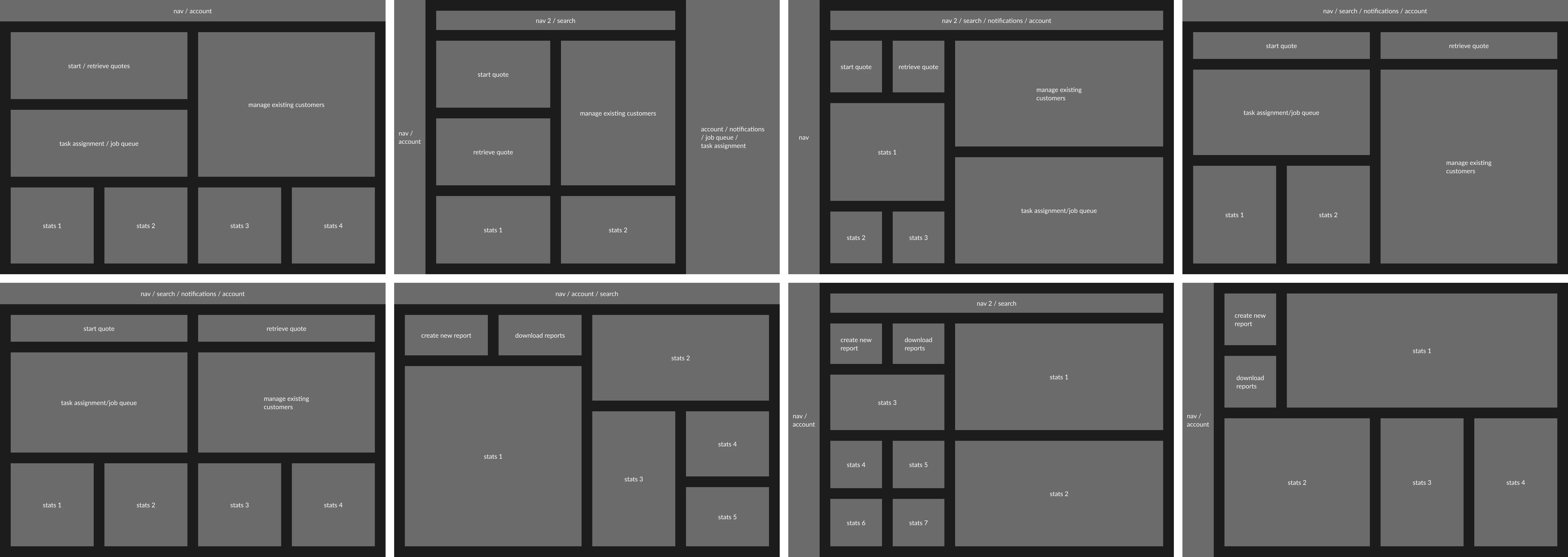
Prototyping, Visual Exploration & Iteration
Experimented with layout, colour, and typography to prioritise user tasks. Focused on:
Enhancing stakeholder buy-in through visually pleasing UI.
Showcasing operational efficiency and error reduction.
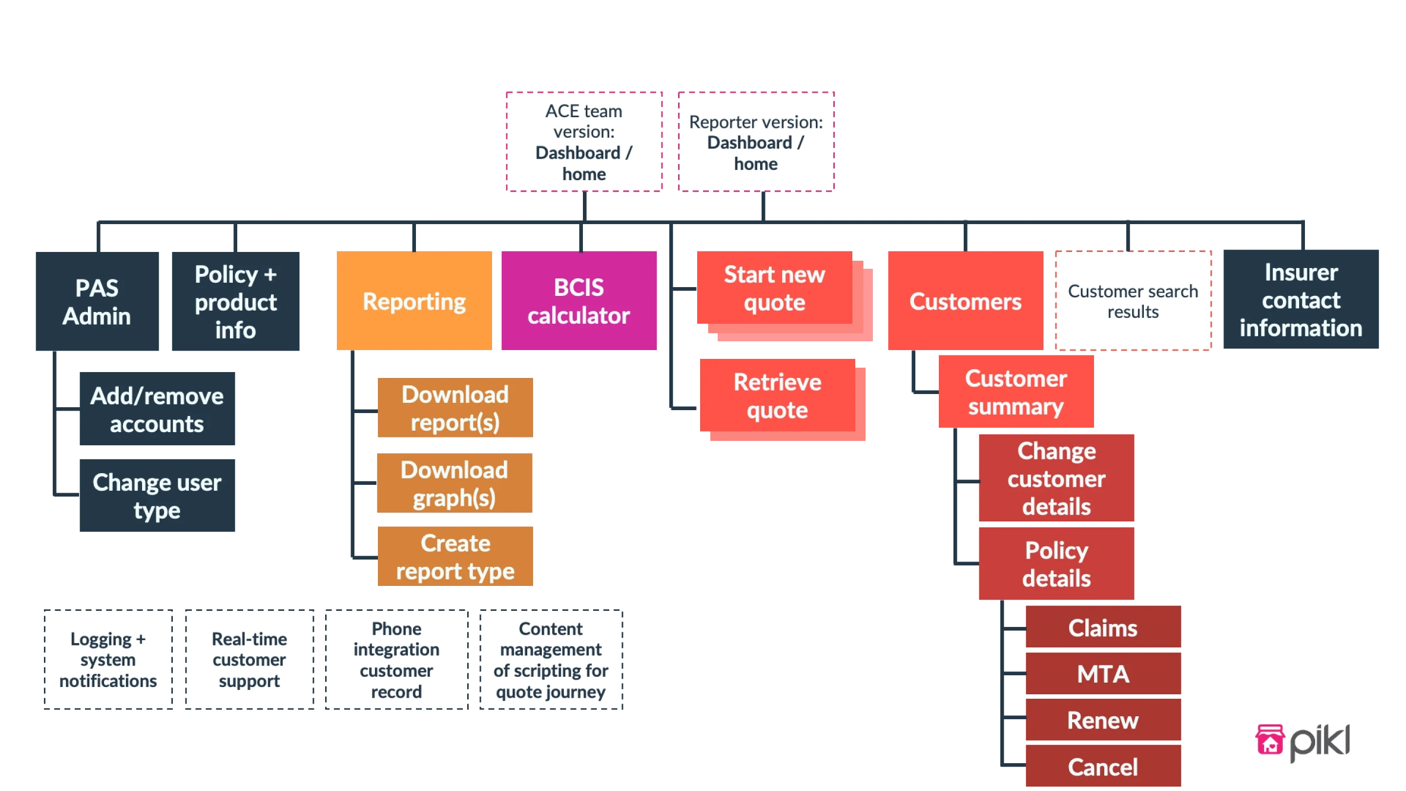
Final Concepts
These concepts showcase key interface improvements aimed at resolving the identified pain points.
Designed around common tasks like quoting, prominently displaying quote-related elements and task management features for scalability.
A secondary dashboard demonstrated consistent card structures for customised interfaces.
A scrolling flow allowed for non-linear task handling while reducing memory strain and time wastage. A guiding script further simplified the process.
Included an activity feed to track changes, addressing scalability and validation needs.
Potential Impact
These impact statements are hypothetical, as this case study explores a concept rather than a deployed solution. Still, they are likely outcomes inferred from the design improvements and efficiencies achieved.
Automated bulk actions reduced repetitive tasks, cutting manual work significantly.
Side navigation simplified the complex structure, ensuring intuitive access to information.
Visual and structural improvements fostered confidence in the redesign’s business impact.
Reflections & Learnings
Key Challenges
Limited primary data made ideation difficult but highlighted the importance of secondary research and intuition.
Lacking insurance domain expertise initially slowed progress but underscored the value of onboarding.
Limited information on internal tools required piecing together insights creatively.
What I’d Do Differently
Invest more time understanding Pikl’s insurance niche.
Validate modular card structures more rigorously by comparing with alternatives.
Use observational studies more over direct questions for gathering authentic user feedback.
Additional Insights
The modular system supports future features like real-time collaboration without major structural overhauls.
Reduced cognitive load for repetitive processes, creating a more intuitive experience.
Added value through detailed logs of customer interactions, enabling better decision-making.